
Jonathan Lawes: Interactions with Colour

An exclusive new collection for Print Club London.
We’re thrilled to announce the launch of ‘Interactions with Colour’, a brand new exclusive original print collection by long-time Print Club favourite Jonathan Lawes. Known for his layered, geometric abstractions and bold, intuitive use of colour, Jonathan’s latest series is a celebration of spontaneity, aesthetic exploration, and vibrant expression.
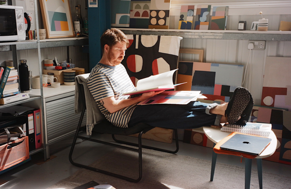
We caught up with Jonathan in his light-filled studio to hear more about the ideas behind this new body of work, how he approaches the creative process, and what’s next on the horizon.

What is the title of this new collection, and what narrative or concept underpins it?
The title of this little collection is ‘Interactions with Colour’. Colour forms one of the most important aspects of my work. I wanted people to really enjoy this playful aesthetic and take something positive from it.
What were the key inspirations behind this body of work?
As the title suggests, I just wanted to experiment and ultimately have fun with colour. I’m constantly thinking about whether colours go together—and in reality, the only way to find out is to try it. This whole collection is a nod to that exact practice. I love all the surprises that come with this way of working.
How does your studio environment—both physically and emotionally—influence your creative process?
My studio plays a really big part in my process. I’m lucky enough to have a large space where I can spread out and work on many different projects at once. I also have two large windows that flood the studio with natural light in the warmer months—I find this is the time where I get the most inspiration, especially in terms of colour.
Were there specific techniques or methodologies you set out to explore with this series?
I do like to start off with a palette for my projects, but I allow the flexibility of other colours to join in as the process develops. In order for this collection to have a harmonious feeling to it, recurring elements were key to linking the pieces together.
The colour palette across the works feels intentional and harmonious—was that a conscious decision from the outset?
Yes, although a lot of it comes from experimentation. I do start with a palette, but I’m not precious about sticking to it. I let the work evolve naturally, and that’s part of the fun.
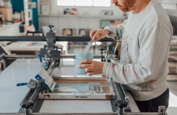
Could you walk us through your process, from initial sketches to final execution?
I start off with a rough idea of what I want to do, but unlike the majority of other silkscreen printers, I don’t have it all meticulously set out. A lot of the thought process happens directly on the printing table. Compositions form organically, changing with each layer of colour until I’m happy with a finished outcome.
How do colour and form function as part of the visual language in this collection?
Colour and form are the prominent things in this collection, like in a lot of my work. There’s no hidden meaning behind it all. It all comes from an experimental process and is solely about aesthetics and the beauty in that.
Looking ahead, what’s next for you? Are there any upcoming solo exhibitions or projects you’re particularly excited about this year?
I’ve currently got a solo show running at The Vanner Gallery in Salisbury. It’s a fantastic space and I urge you to give them a follow—or even better, pop into the gallery over the next few weeks. The show runs until Saturday 21st June.
Explore the full Interactions with Colour collection — available exclusively at Print Club London.


June 2025